第 6 章 Stat function
6.2 直方圖
6.2.1 x軸變數特質
間斷變數
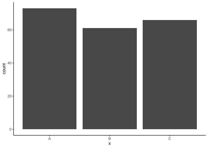
geom_bar():用來呈現不同x類別的樣本個數。- 樣本個數會自動計算,呈現在y軸。
set.seed(2020)
df_bar <-
  data.frame(
    x=sample(LETTERS[1:3], 200, replace = T)
  )
table(df_bar$x)
A B C 73 61 66
ggplot(df_bar)+
  geom_bar(
    aes(x=x)
  )
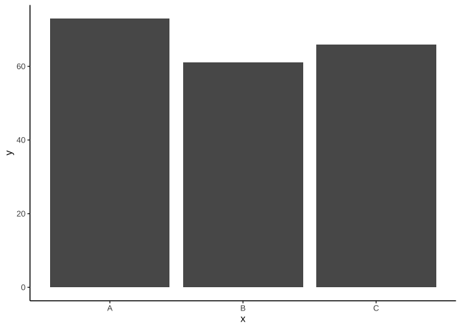
geom_col():用來呈現不同x類別下y值高度。- data frame要提供y值。
df_col <-
  data.frame(
    x=c("A", "B", "C"),
    y=c(73, 61, 66)
  )
ggplot(df_col)+
  geom_col(
    aes(x=x, y=y)
  )
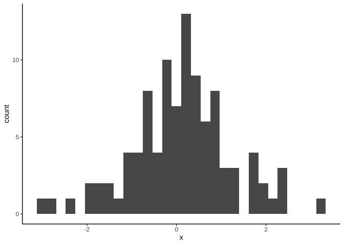
連續變數
set.seed(2020)
df_hist <- data.frame(
  x = rnorm(100)
)
ggplot(df_hist)+
  geom_histogram(
    aes(x)
  )
6.3 The Economist


The base of bars touches ground
Flip x-y coordinate might be a better choice.
Guide lines (major tick lines) are there to guide the reading of height values.

bar chart might not be a good choice, especially when
too many categories;
need to avoid visual projection of volume comparison (like where base does not start from 0).

- Proper order of level sequence can give more information.
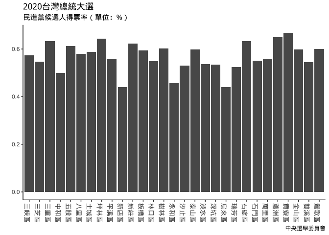
6.4 2020台灣總統大選
election2020 = jsonlite::fromJSON(
  "https://www.dropbox.com/s/a3torx0p41hheb6/presidentElection2020.json?dl=1"
)
canvas = ggplot(data=election2020) plt_election01 = {
canvas +
geom_col(
aes(
x=`鄉(鎮、市、區)別`,
y=`(3)
蔡英文
賴清德`)
)
}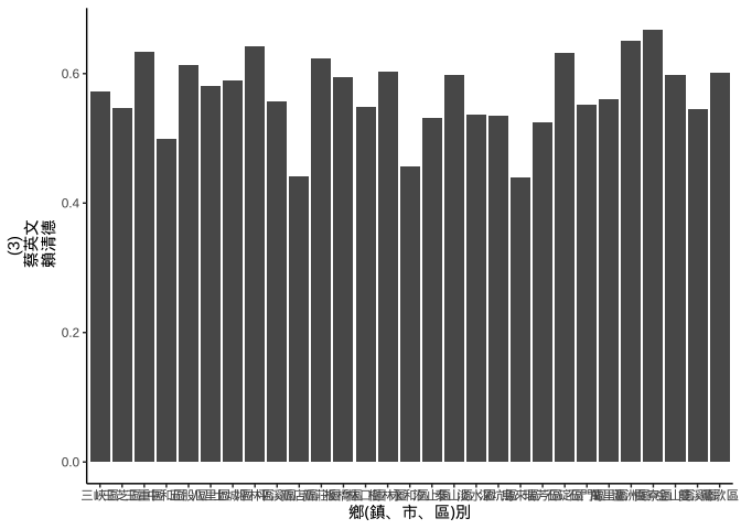
plt_election_turnX270 = {
  plt_election01 +
    theme(
      axis.text.x =
        element_text(angle=270, size=unit(10, "pt"))
      # angle = 90, "區峽三",angle = -90 (要寫360-90) 才"三峽區"
      )+
      labs(
        title="2020台灣總統大選",
        subtitle = "民進黨候選人得票率(單位:%)",
        caption="中央選舉委員會",
        y="", x=NULL
      )
}
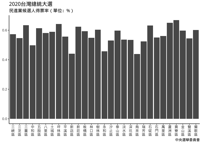
文字直排
plt_election_xVeritical = {
  plt_election01 %+%
    {
      # 行政區名每個字換行
      plt_election01$data$`鄉(鎮、市、區)別` %>%
        stringr::str_split("") %>%
        map_chr(paste0, collapse="\n") ->
        plt_election01$data$`鄉(鎮、市、區)別`

      plt_election01$data # { }最後一行必需是個data frame
    } +
      labs(
        title="2020台灣總統大選",
        subtitle = "民進黨候選人得票率(單位:%)",
        caption="中央選舉委員會",
        y=NULL, x=NULL
      )
}
若中文字直排很常要用到可以把它寫成如下函數:
str_turnVertical = function(strVector){
  require(dplyr)
  strVector %>%
    stringr::str_split("") %>%
    purrr::map_chr(paste0, collapse="\n")
}
plt_election_verticalWord = {
plt_election01 %+% {
plt_election01$data %>%
mutate(
`鄉(鎮、市、區)別`=
str_turnVertical(`鄉(鎮、市、區)別`)
)
}
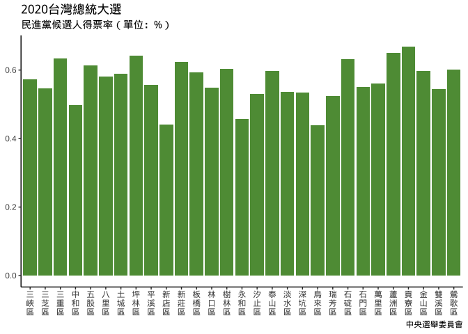
}圖片取色
想使用與民進黨黨徽相近的色相來畫圖:
- 民進黨黨徽(
hsl(120, 100%, 30.2%)):https://upload.wikimedia.org/wikipedia/zh/thumb/b/b3/Flag_of_Democratic_Progressive_Party.svg/1200px-Flag_of_Democratic_Progressive_Party.svg.png
可利用Boxy SVG,
先創造一個可塗內部顏色的物件,如方形或圓形。
點選該物件,
選右拉欄fill
選「取色滴管」
滴管移到黨徽上即可看到色碼。
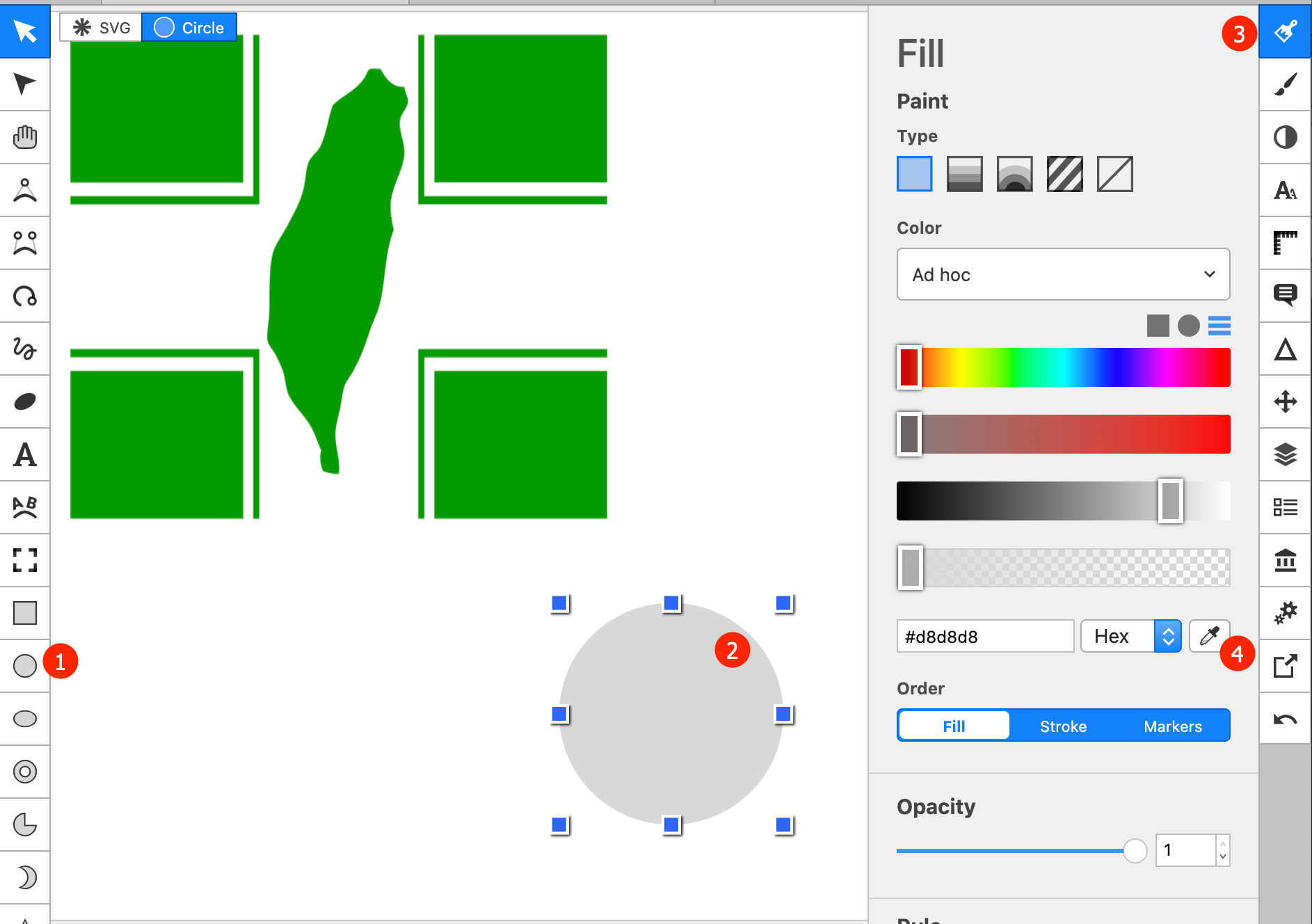
我們會維持色相,只去調整另兩個參數:
colorspace::choose_color()設定hue: 120, 在可選色區域內選你要的顏色之chroma,lumina。
#5E9A43
plt_election01_green = {
  canvas +
  geom_col(
    aes(
      x=`鄉(鎮、市、區)別`,
      y=`(3)
 蔡英文
 賴清德`), fill="#5E9A43"
  )
}你也可以不從頭畫,直接以「ggplot只是一種用在特定結構的list上之print method」的角度去思考改色, 一切結果都是操控在list元素值角度去改色:
plt_election_xVeritical_green <- plt_election_xVeritical

plt_election_xVeritical_green$layers[[1]]$aes_params$fill <- "#5E9A43"

plt_election_xVeritical_green
plt_election_verticalWord_green ={
plt_election_verticalWord # 另外取名,方便後面討論
}改變排序
x軸的順序是依變數欄位變成factor後的levels順序決定。
data_chosenLevels = {
  plt_election_xVeritical_green$data %>%
  arrange(`(3)
 蔡英文
 賴清德`) %>%  # ---> (*)
  .$`鄉(鎮、市、區)別` -> chosenLevels

  plt_election_xVeritical_green$data %>%
    mutate(
      `鄉(鎮、市、區)別`=factor(
        `鄉(鎮、市、區)別`,
        levels=chosenLevels # ---> (**)
      )
    )
}
plt_election_xVeritical_green_chosenLevels = {
plt_election_xVeritical_green %+%
data_chosenLevels
}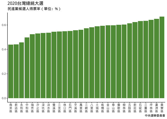
若發現levels排序反了,可以data_chosenLevels定義時:
(*)改
arrange(desc(...)); 或(**)改
levels=rev(chosenLevels)
plt_election_xVeritical_green_chosenLevels_rev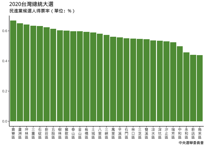
6.4.1 touch ground
plt_xVertical_yGrounded = {
  plt_election_xVeritical_green_chosenLevels_rev +
  scale_y_continuous(
    expand = expansion(mult = 0, add = 0) # since it's default, expansion() will do
  )
}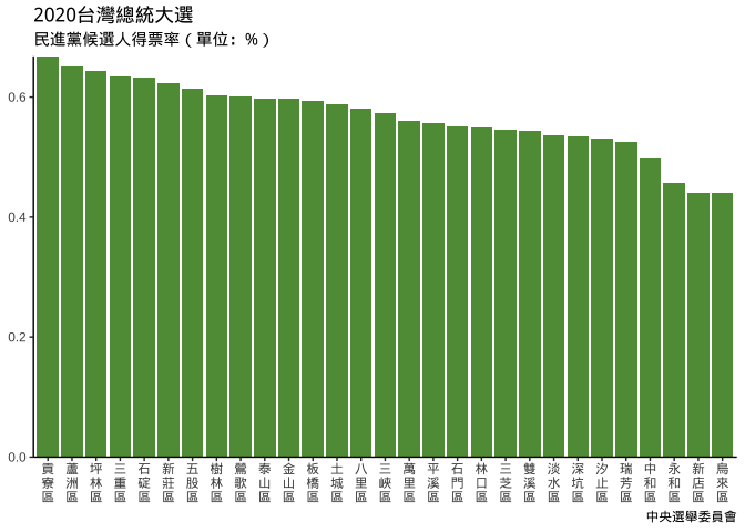
6.4.2 theme setting
no x ticks
no y line
no y tick
set meaningful major panel grid line
6.4.2.1 theme design
testPlot = {
    testdata <-
      data.frame(
        x=1:100,
        y=1:100
      )
    ggplot(testdata) +
      geom_blank(
        aes(x=x, y=y)
      )
  }
method1: not good, no other flexibility
theme_method1 <- theme(
  axis.ticks.x = element_blank(),
  axis.line.y = element_blank(),
  axis.ticks.y = element_blank(),
  panel.grid.major.y = element_line(size=0.5, colour = "#b8c7d0")
)
testPlot + theme_method1- 沒有彈性改變其他theme設定, 只能回前面改。
method2: better.
theme_method2 = function(...){
  theme(
    axis.ticks.x = element_blank(),
    axis.line.y = element_blank(),
    axis.ticks.y = element_blank(),
    panel.grid.major.y = element_line(size=0.5, colour = "#b8c7d0"),
    ...
  )
}
testPlot + theme_method2()# 臨時想加背景色
testPlot + theme_method2(
panel.background = element_rect(
fill="aliceblue"
))plt_election_xVeritical_green_chosenLevels_rev +
scale_y_continuous(
expand=expansion(0,0)
) +
theme_method2()6.4.2.2 Economist Bar theme
plt_election_xVeritical_green_chosenLevels_rev +
  scale_y_continuous(
      expand=expansion(0,0))+
  theme_method2()
Is it possible to wrap up
theme_bar_economist <- function(...){
    scale_y_continuous(
      expand=expansion(0,0))+
    theme_method2(...)
}
So that
plt_election_xVeritical_green_chosenLevels_rev +
  theme_bar_economist()
No.
add_theme_economist <- function(gg,...){
  assertthat::assert_that(is.ggplot(gg))
  gg+scale_y_continuous(
      expand=expansion(0,0))+
    theme_method2(...)
}
plt_election_xVeritical_green_chosenLevels_rev %>%
add_theme_economist()改變width
- 兩個類別間的距離定義為1單位,以類別tick為中心,可設定bar width, 如為1則以tick往左右各0.5單位。
geom_col(... , width=...)若已畫好可以直接去改layer屬性值:
plt_election_xVeritical_green_chosenLevels_rev[["layers"]][[1]][["geom_params"]][["width"]] <- 0.6
plt_election_xVeritical_green_chosenLevels_rev %>% add_theme_economist()改變高寬比例aspect.ratio
plt_election_xVeritical_green_chosenLevels_rev %>%
  add_theme_economist() +
  theme(
    aspect.ratio = 1/3
  )
座標改變
ggplot(data=data_chosenLevels)+
  geom_col(
    aes(y=`鄉(鎮、市、區)別`, x=`(3)
 蔡英文
 賴清德`),  fill="#5E9A43"
  ) +
  scale_x_continuous(
    expand = expansion(0,0)
  ) + theme(
    axis.ticks.y = element_blank(),
    axis.line.x = element_blank(),
    axis.ticks.x = element_blank(),
    panel.grid.major.x = element_line(size=0.5, colour = "#b8c7d0"),
    aspect.ratio = 3/1
  ) +
  labs(
        title="2020台灣總統大選",
        subtitle = "民進黨候選人得票率(單位:%)",
        caption="中央選舉委員會",
        y=NULL, x=NULL
      )
plt_election_xVeritical_green_chosenLevels_rev %+% {
levels(data_chosenLevels_rev$`鄉(鎮、市、區)別`) %>%
str_remove_all("\\n") -> levels(data_chosenLevels_rev$`鄉(鎮、市、區)別`)
data_chosenLevels_rev
} %>%
add_theme_economist() +
coord_flip()6.4.3 geom_bar
aes y mapping是由geom_bar去呼叫stat_count函數計算count(數個數)。
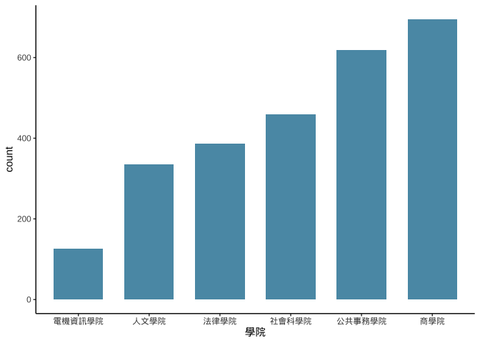
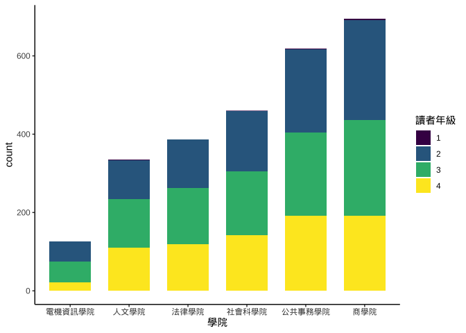
6.5 圖書借閱資料
資料整理:2014-09-01到2015-06-30間資料
library100_102 = {
  library100_102 <- read_csv("https://www.dropbox.com/s/wuo5o6l55lk68l6/library100_102.csv?dl=1")

library100_102 %>%
  mutate(
    借閱日期=date(ymd_hms(借閱時間)),
    借閱年=year(借閱日期)
  ) -> library100_102
library100_102
}
library2014 = {
library100_102 %>%
filter(
借閱日期 %>% between(ymd("2014-09-01"),ymd("2015-06-30"))
) -> library2014
library2014 %>%
group_by(學號) %>%
summarise(
學院=last(學院),
讀者年級=max(讀者年級)
) %>%
ungroup() %>%
mutate(
讀者年級=讀者年級
)-> library2014
library2014 %>%
mutate(
學院=reorder(學院,學號,length,order=T),
讀者年級=reorder(讀者年級,讀者年級, order=T)
) -> library2014
}pltLib_ggplotOnly = {
library2014 %>%
  ggplot()-> pltLib_ggplotOnly
pltLib_ggplotOnly
}library2014 %>%
ggplot()-> pltLib_ggplotOnlypltLib_ggplotOnly+
geom_bar(
aes(x=學院), fill="#5A99B3", width=0.7
)
pltLib_ggplotOnly +
  geom_bar(
    aes(x=學院,fill=讀者年級), width=0.7
  )
6.6 Positions
所有的geom都有position設定,如:geom_bar(position="stack")。
6.6.1 stack
- stack:疊上
使用position="stack"或position=position_stack(...)設定——後者有更多調整彈性。
if(!require(devtools)) install.packages("devtools")
devtools::install_github("kassambara/ggpubr")
df_position = data.frame(
x=rep(c("a","b"), each=3),
y=c(3,1,3,8,6,10)
)pltPosition_none = {
df_position %>%
ggplot(aes(x=x,y=y))+
geom_point(
color="#5A99B3"
) +
scale_y_continuous(
breaks=c(1,3,6,8,10)
)+
annotate(
geom="text",
x=1.1, y=3, label="x 2" # 利用factor的type為integer的特質設x位置
)+
labs(
title="Position identity",
subtitle="Position沒有調整"
) -> pltPosition_none
pltPosition_none
}pltPosition_stack =
{
df_position %>%
ggplot(aes(x=x,y=y,color=y))+
geom_point(
position="stack", color="#5A99B3"
)+
labs(
title= "Position stack",
subtitle = "各x類y值疊加上去"
)-> pltPosition_stack
pltPosition_stack
}ggpubr::ggarrange(
pltPosition_none,
pltPosition_stack
)6.6.2 fill
- fill:填滿
相同x值下有多個y值時(標準化成同高度,呈現比重變化用)
使用position="fill"或position=position_fill(...)設定,後者有更多調整彈性。
pltPosition_fill = {
  df_position %>%
  ggplot(aes(x=x,y=y,color=y))+
  geom_point(
    position="fill", color="#5A99B3"
  )+
  labs(
    title= "Position fill",
    subtitle = "各x類y值縮放同比例使加總為1"
  )-> pltPosition_fill
  pltPosition_fill
}ggpubr::ggarrange(
pltPosition_none,
pltPosition_fill
)6.6.3 dodge
- dodge:躲避
在不改變vertical position下,調整horizontal position使geom不重疊。
使用position="dodge"或position=position_dodge(...)設定,後者有更多調整彈性。
pltPosition_dodge =
  {
    df_position %>%
    ggplot(aes(x=x,y=y))+
    geom_point(
      color="#5A99B3", alpha=0.3, size=4
    )+
    geom_point(
      position=position_dodge2(width=0.3), color="#5A99B3"
    )+
    labs(
      title= "Position dodge",
      subtitle = "淺色大圈為原始資料,\n深色小圈為position調整後" # \n 為換行符號
    )-> pltPosition_dodge
    pltPosition_dodge
}ggpubr::ggarrange(
pltPosition_none,
pltPosition_dodge
)6.6.4 y軸文字標示
pltLib_ggplotOnly+
  geom_bar(
    aes(
      x=學院
    )
  ) +
  geom_text(
    data={
      pltLib_ggplotOnly$data %>%
        group_by(
          學院
        ) %>%
        summarise(
          count=n()
        ) %>% ungroup()
    },
    mapping=aes(x=學院, y=count, label=as.character(count)),
    vjust=0, nudge_y = 10
  )
vjust: 一個字的頭頂為1, 字底為0. vjust用來決定mapping中的(x,y)指的是字的頭-底位置。
hjust: 一個字串的最左為0, 最右為1。hjust用來決定mapping中的(x,y)指的是字串的左-右位置。
nudge是針對mapping中的(x,y)要往y加/減多少(nudge_y)或要往x加減多少(nudge_x)
pltLib_stackedBarWithText <- function(position){
  pltLib_ggplotOnly+
    geom_bar(
      aes(
        x=學院, fill=讀者年級
      )
    ) +
    geom_text(
      data={
        pltLib_ggplotOnly$data %>%
          group_by(
            學院, 讀者年級
          ) %>%
          summarise(
            count=n()
          ) %>% ungroup() -> xx
        xx
      },
      mapping=aes(x=學院, y=count, label=as.character(count)),
      position=position
    )
}pltLib_stackedBarWithText("identity")pltLib_stackedBarWithText("stack") 6.6.4.1 How Layers Compute Mapping Values
pltLib_ggplotOnly+
    geom_bar(
      aes(
        x=學院, fill=讀者年級
      )
    ) -> gg0
gg0$layers[[1]] -> layersEnv

get("data", envir=layersEnv)
ls(layersEnv) layersEnvrlang::env_parent(layersEnv[["geom"]])
rlang::env_parent(layersEnv)6.6.5 連續變數
直方圖的另一個常見用法是將連續變數:
(一)先切成一段段不重疊的數值區間: 稱為binning,每個區間稱為bin。
(二)以每個bin為長條圖x軸的類別變數進行作圖
set.seed(2019)
x <- rnorm(100)
head(x)
ggplot2::cut_interval(x,n=8) -> x_interval
levels(x_interval)
head(x_interval)ggplot2::cut_interval(x,n=8): 將連續資料x分成n個區間,並將x值各別對應該所屬區間(形成x_interval)
df_x <- data.frame(
  x=x,
  x_interval=x_interval
)

df_x %>%
  group_by(x_interval) %>%
  summarise(
    interval_count=n()
  ) %>%
  ungroup() %>% #View
  ggplot(aes(x=x_interval))+
  geom_col(
    aes(y=interval_count)
  )
6.6.6 geom_histogram
df_x %>%
  ggplot(aes(x=x))+
  geom_histogram(bins=8)
「geom_bar, geom_col」和geom_historgram最大的不同是長條間有沒有留空隙。連續型x變數應使用geom_histogram以正確保留其連續意涵。
6.6.7 optimal bins
原則上「樣本越大」、「資料越集中」則bin數目越多。有不少決定bins或binwidth的公式,大致上大同小異。這裡我們使用grDevices::nclass.FD(), 依Freedman-Diaconis法則選bins數。
optimBins <- grDevices::nclass.FD(df_x$x)
optimBins
df_x %>%
  ggplot(aes(x=x))+
  geom_histogram(bins=optimBins)