第 5 章 Aesthetics📋
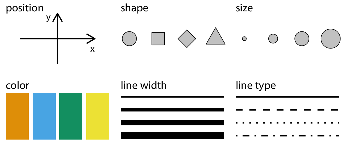
資料視覺感受取決於aesthetics(美學元素):
幾何圖形位置:由x, y座標(cartesian coordinate),或r, theta座標(polar coordiate)決定。
色彩:圖形外框(stroke color)、圖形內部填充(fill),通透度(alpha)。
線條設計:linetype
大小粗細:size
5.1 mapping and scales
geom_xxx( mapping=aes(x=…, y=…), data )
which column in data determines which aesthetics defined inside aes(...) as pairlist of
aesthetic = data column- ggplot2 cheat sheet gives you a quick glance of options of aesthetic that each geom has.
5.2 scales
每個geom有它可以使用的aes,geom裡的aes只是指定不同美學元素的決定資料變數,然而資料變數「值」如何映到「美學呈現」透過scale來更動。

ggplot2的所有aesthetic specifications: https://ggplot2.tidyverse.org/articles/ggplot2-specs.html
5.2.1 scale函數基礎元素

- limits:
- 連續型資料:
limits=c(lowerbound, upperbound) - 間斷資料:
limits=c(.,.,...)將可接受的範圍值一一列出來。
- 連續型資料:
lowerbound可接受負無窮-Inf, upperbound可接受正無窮Inf.
5.2.2 x_date📋
- drake plan (aka drake_aes2): https://www.dropbox.com/s/fbmcy9g5bnpg3a6/drake_aesthetics2.Rmd?dl=0

(major) breaks: 會有標示時間文字的breaks, 標示重要的時間點,如每個結尾0/5的年份。
minor_breaks: 只有標點(tick)但不會標示文字的breaks。
經濟學人:
Sample starting/ending time must be major breaks.
(major) breaks represents the beginning of a frequency cycle (月資料只選1月), or years with 0/5 endings.
minor_breaks tell readers the data frequencye.
Year labels: YYyy where YY will only appear once.
major_breaks # <drake_aes2>

labels # <drake_aes2>
5.3 stand-alone targets
scale layer can be a Drake target.
geom layer with mapping and data definition can be a Drake target.
5.3.1 scale target
{r sale1} scale1 = # <drake_aes2> scale_x_date( breaks = major_breaks # <drake_aes2> )
{r ggplot1_1} ggplot1_1 = { # <drake_aes2> ggplot0 + # <drake_aes2> scale1 # <drake_aes2> }
5.3.2 geom target
5.3.2.1 範例:事件陰影
- 2008 financial crisis timeline: https://www.thebalance.com/2008-financial-crisis-timeline-3305540
financialCrisis = data.frame( # <drake_aes2>
  title=c("2008 Financial crisis"),
  start=ymd(c("2008-08-01")),
  end=ymd(c("2008-12-01"))
)
ggplotWithEvent = { # <drake_aes2>
plot_breaksLabelsEditted + # <drake_aes2>
geom_rect(
mapping = aes(
xmin = start, xmax = end
),
data = financialCrisis, # <drake_aes2>
ymax = Inf, ymin = -Inf # 定值的mapping放在aes()外
)
}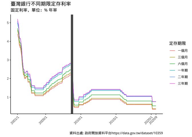
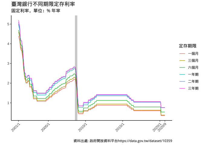
ggplotWithEventAlpha = { # <drake_aes2>
  plot_breaksLabelsEditted + # <drake_aes2>
    geom_rect(
      mapping = aes(
        xmin = start, xmax = end
      ),
      data = financialCrisis, # <drake_aes2>
      alpha= 0.3, # 透明度調整[0,1]間
      ymax = Inf, ymin = -Inf # 定值的mapping放在aes()外
    )
}
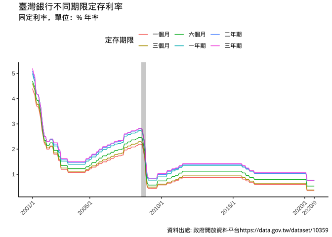
5.3.3 legend position
ggplotLegendTop = { # <drake_aes2>
  ggplotWithEventAlpha + # <drake_aes2>
    theme(
      legend.position = "top"
    )
}
5.4 Color
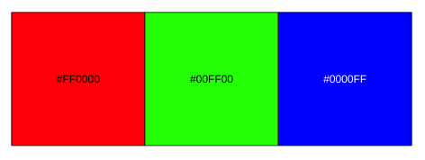
光的三原色為R(紅)G(綠)B(藍),三種光原色一起發光就會產生俗稱的白光。事實上光是沒有顏色的。而人類眼睛所看物體的顏色,是光線照在物體上所反射的波長被眼睛擷取到而決定人類所看到的顏色。白色就是所有的光都被反射所呈現的顏色,反之,黑色則是吸收了所有的光。
library(scales)
show_col(
  c(rgb(1,0,0),rgb(0,1,0),rgb(0,0,1)),  ncol=3,
)
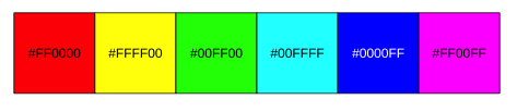
5.4.1 Hue色相
show_col(
  c(rgb(1,0,0), # 紅
    rgb(1,1,0), # (黃)紅到綠:紅固定,綠越加越多,綠到1,接著綠固定,紅下降
    rgb(0,1,0), # 綠
    rgb(0,1,1), # (青)綠到藍:綠固定,藍越加越多,藍到1後,綠才降到0
    rgb(0,0,1), # 藍
    rgb(1,0,1)),# (紫)藍到紅:藍固定,紅上升到1,(回到頭:藍才下降)
  ncol=6
)
show_col(
  c(rgb(1,0,0), # 紅 -->
    rgb(1,0.5,0),
    rgb(1,1,0), # 黃 -->
    rgb(0.5,1,0),
    rgb(0,1,0), # 綠 -->
    rgb(0,1,0.5),
    rgb(0,1,1), # 青 -->
    rgb(0,0.5,1),
    rgb(0,0,1), # 藍 -->
    rgb(0.5,0,1),
    rgb(1,0,1), # 紫 -->
    rgb(1,0,0.5)),
  ncol=12, labels=F
)

色相環上顏色角度差異越大,視覺上的差異感受也越大。要區分資料的類別,多是透過Hue的角度差異造成。
5.4.2 Chroma彩度
Chroma(彩度): 彩度。
Luminance(流明度): 眼睛對色彩明亮度的感受(和客觀測量的光線亮度是不同的概念)。
同一橫排有相同流明度(眼睛感受亮度相同),但不同排彩度不同,越下排色彩越不鮮豔。
show_col(
  c(hue_pal(c=100)(3), # 彩度100
    hue_pal(c=50)(3), # 彩度50
    hue_pal(c=30)(3)), # 彩度30
  ncol=3)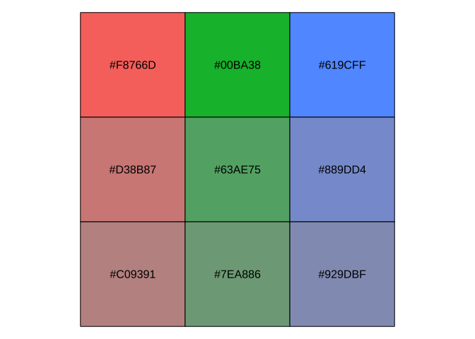
相同色相Hue, 相同流明Luminance下,不同彩度chroma會形成如圖上同為紅色,但不同彩度的子群體感受。彩度適合用來創造階層分類下,母群有不同子群的視覺效果。例如:台北市、新北市用不同hue, 但各自底下的行政區則用不同彩度區別。
5.4.3 Luminance流明
show_col(
  c(hue_pal(l=100)(1), # 流明100
    hue_pal(l=80)(1), # 流明80
    hue_pal(l=65)(1)), # 流明65
  ncol=3)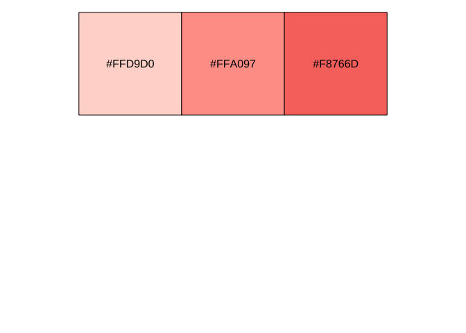
相同色相Hue, 相同彩度chroma下,不同流明luminance會形成如圖上視覺感受淺深不同的紅色,形成視覺化大小層次變化的感受,故Luminance適合用來呈現資料大小排序。
scales::hue_pal(): 依指定c(chroma), l(luminance), 產生一個function(n)——n 可指定將色相環做n等距取色。
h=c(0,360)+15, 即15度一圈回到15度。可用c(x,y)限制取色區間c=100:不同h/l組合它的最大值也不同。l=65: 介於0,100間
disk1 <- hue_pal(c=100) # c=100, l=65
disk2 <- hue_pal(c=50) # c=50, l=65
disk3 <- hue_pal(c=30) # c=30, l=65

show_col(
  c(
    disk1(3),
    disk2(3),
    disk3(3)
  )
)- 可以產生函數的函數叫generator function, 所以hue_pal是個generator function。
5.4.4 scale_color
色碼
顏色輸入方式可採以下幾種:
rgb(r,g,b): r, g, b在0-1間,但很多是依正統定義在0-255間。hcl(h,c,l): \(h\in [0,360]\), \(l \in [0,100]\)hex code:
#xxxxxxx為數字或字母(字母大小寫皆可)
5.4.4.1 如何選色
透過scale_color/fill_xxx函數來決定資料與顏色的對應關係。xxx有下列幾種:
- qualitative: 類別資料,且無大小排序之分。(不同hue)
- 選數個hue
- 如:
scale_color_hue()
- sequential: 類別資料有大小排序之分,或連續資料。(不同luminance)
- 選一個hue,設定不同luminance
- discrete data: 如
scale_color_viridis_d()continuous data: 如scale_color_gradient()、scale_color_viridis_c()
- diverging: 兩類別的強度資料,如只有國民黨/民進黨兩黨候選人下,各縣市支持國民黨的比例介於[0,1], 0-支持民進,1-支持國民,0.5-中間。 (兩個hue, 各自調高luminance到最亮時均會是白色,代表中間值0.5)
- 選2個hue,設定不同luminance
scale_color_gradient2()
原則上資料本身的class若正確,但ggplot的顏色內定選擇自然會吻合資料特性。不一定需要透過scale_color修改。
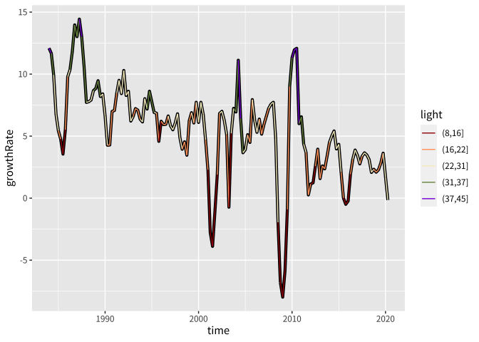
5.4.5 台灣景氣循環📋
drake plan (aka drake_aes3): https://www.dropbox.com/s/vtkoe3uewzlhrij/drake_aesthetics3.Rmd?dl=0
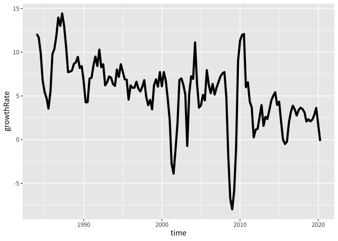
plt_basic = { # <<drake_aes3>>
  canvas + # <<drake_aes3>>
    geom_line(size=1.5)
}
plt_withColors0 = { # <<drake_aes3>>
  plt_basic +
    geom_line(
      aes(color=light)
    )
}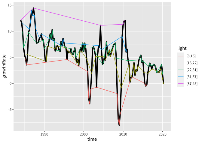
除座標外, 其他美學元素皆有分群的意思,所以5個燈號會分5群畫——可以使用aes(group=定值),讓所有資料不分群。
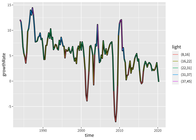
plt_withColors = { # <<drake_aes3>>
  plt_basic +
    geom_line(
      aes(color=light,
          group=1) # 增加group, 以取消color帶來的分群
    )
}
ggplot將燈號顏色視為qualitative(不可排序類別)
canvas$data$light %>% is.ordered()將燈號改成ordered factor
canvasOrdered = {  # <<drake_aes3>>
  plt_basic %+% # %+% 會將data frame替換掉
    {
      df_bcWithLights %>% # <<drake_aes3>>
        mutate(
          light=ordered(light)
        )
    }
}
plt_withColors_order = { # <<drake_aes3>>
canvasOrdered + # <<drake_aes3>>
geom_line(
aes(color=light, group=1)
)
}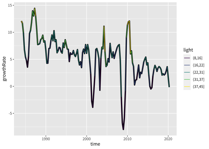
plt_withColors_order可以感覺到5個燈號顏色有流明度的變化,(37, 45]的顏色最亮,而(8, 16]最暗,同時5類顏色的色相有明顯不同:資料被視為類別可排序。
ggplot2對於discrete data內訂使用的scale_color_XXX函數分別為:
- 不可排序:
scale_color_hue()
- 可排序:
scale_color_viridis_d()
viridis指得是為色盲者所開發的某一系列色系。
若要進一步修改,要使用對的對應scale_color_XXX,如:
改變圖例說明:
plt_color_orderLegend <-  # <<drake_aes3>>
  plt_withColors_order +
  scale_color_viridis_d(
name="景氣訊號",
  labels=c('低迷','低迷-穩定間', '穩定','穩定-熱絡','熱絡')  )
5.4.6 手動設定
scale_color_manual
選色利用:
Boxy SVG
Colorhunt: https://colorhunt.co 圖面最好不要有過多不同的顏色,4色或以下比較好。
Qualitative data:
plt_withColors # <<drake_aes3>> 
手動修改
plt_withColors +
  scale_color_manual(
    values=c("#a20a0a","#ffa36c","#f6eec9", "#799351", "#892cdc", "#16a596")
  )
5.4.7 使用調色盤
使用scale_color_manual()只能用在改間斷資料且類別少時,其他情境用調色盤(palette)較佳。
畫家在盤上只放上作畫所需的基本水彩/油彩顏色,再依實際需要進行不同比例的基本顏色混色。
基本水彩/油彩顏色=調色盤函數的基本參數設定。
不同比例的基本顏色混色=資料值與最後混出來顏色的對應關係。
palette在ggplot2指得是能把資料映成色碼的函數。
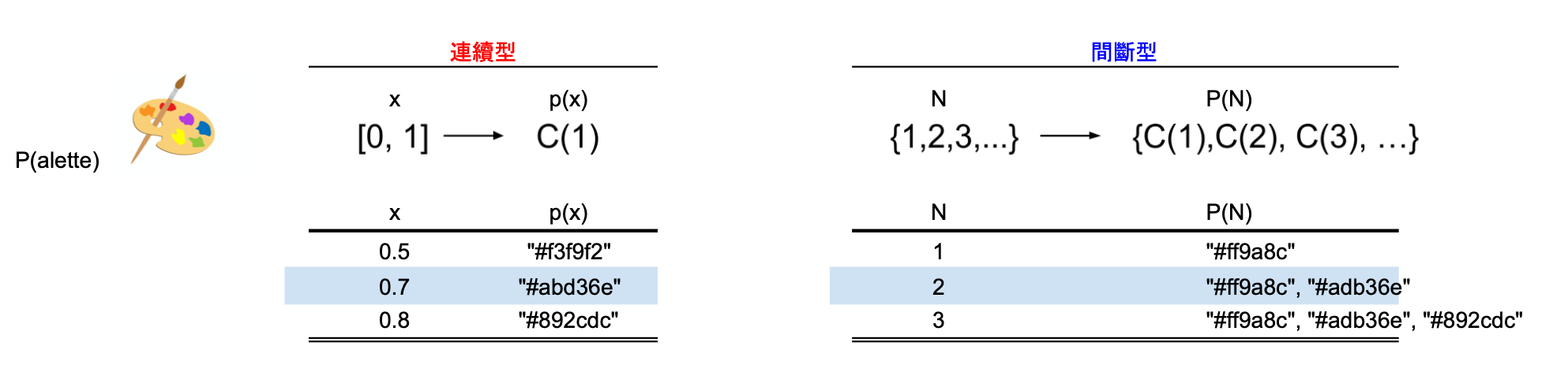
- palette is a function.
連續顏色
Palette function (P):
\([0,1]\rightarrow C^1\), where \(C\) represents a color space.
is a vectorized function.
範例:能將[0,1]間數字向量(含NA)map到色相hcl(h=0)至 hcl(h=120)間的調色盤。
myContinuousePalette = function(x) hcl(h=120*x)x=seq(0, 1, by=0.05)
myContinuousePalette(x) %>%
scales::show_col(ncol = length(x), labels = F)ggplot rescale your data column range to \([0,1]\) so that it can be applied to your palette function. If you want to know the mapping of the columan data to \([0,1]\), you can:
x=sample(-500:500, 329)
x_rescaled = scales::rescale(x, to=c(0,1), from= range(x))
# Check the consistency
x_rescaled %>% myContinuousePalette() %>% head()
scales::cscale(x, myContinuousePalette) %>% head()若f只能接受一個元素值, 且令其回傳值為character type,則:
library(assertthat) # makes it easy to check the pre- and post-conditions of a function, while producing useful error messages.
vectorized_f <- function(x) {
  assert_that(is.number(x), x %>% dplyr::between(0,1))
  x %>%
    map_chr(f)
}
形成它的vectorized function.
f <- function(x) {
  assert_that(is.number(x), x %>% dplyr::between(0,1))
  rgb(x,1,0)
}
vectorized_f <- function(x){
  x %>%
    map_chr(f)
}
x <- sample(seq(0,1,by=0.1),5)
x[[1]] %>% f
try(x %>% f) # **try** runs the command without stopping the process
try(2 %>% f)
try("2" %>% f)
x[[1]] %>% vectorized_f()
x %>% vectorized_f()scales::colour_ramp()
將有限長度的顏色向量賦予插補能力成為continuous palette function:
很多時候continuouse palette,\(f\), 定義在對任何\(x\in [0,1]\),\(f(x)\)產生色碼,使用scales::colour_ramp()可以快速產生一個continuous palette function。
scales::colour_ramp(vector_of_colors)myContinuousePalette <- # <<drake_aes3>>
scales::colour_ramp(
c(hcl(0), hcl(120))
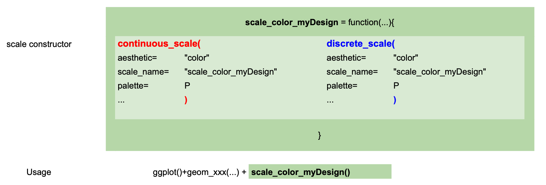
)scale constructor
要用在ggplot時,可透過continuous_scale()函數形成自己獨門的scale_color函數:
# 製作獨家scale_color_XXX函數
scale_color_myPalette_continuous <- # <<drake_aes3>>
  function(...){
  continuous_scale(
  "color", # 給什麼aesthetic元素用
  "myContinuousePalette", # 有錯誤時要怎麼稱呼你的scale
  palette=myContinuousePalette, # palette function: [0,1] -> color
  ...)
  }
# 順道做scale_fill
scale_fill_myPalette_continuous <- # <<drake_aes3>>
function(...){
continuous_scale(
"fill", # 給什麼aesthetic元素用
"myContinuousePalette", # 有錯誤時要怎麼稱呼你的scale
palette=myContinuousePalette, # palette function: [0,1] -> color
...)
}...指得是額外的inputs。- scale_color/fill_myPalette_continuous沒有定義明確的inputs, 所以任何使用上使用者加入的inputs都是額外inputs.
- continuous_scale( ,…)表示它會吸收額外inputs.
- 更多關於…(dot-dot-dot)
df_continuous <-
  data.frame(
    x=c(1, 2, 3, 4),
    y=1,
    color=c(0, 50, 100, NA)
  )

ggplot(df_continuous) +
  geom_raster(
    aes(x=x,y=y,fill=color)
  ) +
  scale_fill_myPalette_continuous(
    name="My color" # name是額外input
  ) +
  theme_classic()
間斷顏色
間斷資料有固定數量的值,如性別只有2類值,大學的年級有4類值,如果你自行設定的調色盤要能用在任何的間斷資料,它必需要能:給定N類值,傳回一個長度為N的色碼向量。
傳回的N個色碼它會依間斷資料在factor情況下的levels排序來上色。
Palette function (P): * \(N\in \{1,2,3,...\}\rightarrow C^N\), where \(C^N\) represents a N-dimenstional color space.
myHuePalette <- scales::hue_pal(h=c(100,200)) # <<drake_aes3>>
show_col(
  myHuePalette(2)
)
show_col(
  myHuePalette(8)
)
scale_color_myHue_discrete <- function(...){ # <<drake_aes3>>
  discrete_scale(
    "color",
    "myHue",
    palette=myHuePalette,
    ...
  )
}
scale_fill_myHue_discrete <- function(...){ # <<drake_aes3>>
discrete_scale(
"fill",
"myHue",
palette=myHuePalette,
...
)
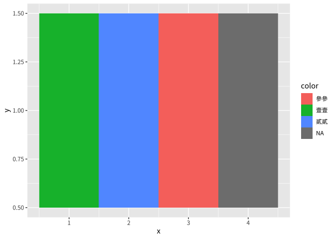
}df_discrete <-
data.frame(
x=c(1,2,3, 4),
y=1,
color=c("壹壹","貳貳","參參", NA)
)
plt_discreteBasic <- ggplot(df_discrete)+
geom_raster(
aes(
x=x, y=y, fill=color
)
)
plt_discreteBasic
plt_discreteBasic +
scale_color_myHue_discrete( # <<drake_aes3>>
name="間斷範例"
)
5.4.8 colorspace選色
使用以下工具選色會更容易達到不同類型資料顏色的要求:
colorspace::choose_palette(gui="shiny")Basic Qualitative
2 Hues with the same
- chroma and lumn
colorspace::qualitative_hcl(n=7, h = c(0, 360), c = 35, l = 85, register = "Custom-Palette")ggplot內訂的sequential color
plt_withColors_order = {
  canvasOrdered + # <<drake_aes3>>
  geom_line(size=1.5)+
  geom_line(
    aes(color=light, group=1)
  )
}
Basic Sequential
Single Hue: 單一色相由亮淺到暗深
使用colorspace::choose_palette
colorspace::choose_palette(gui="shiny")Fixed at 1 hue, 1 chroma, set
beginning lumn1, and the ending lumn2
\(data\rightarrow [lumn1, lumn2]\), the mapping convexity is governed by power1
scale_color_discreteplt_withColors_order_singleHue = {
# 47 -> 98
luminas <- c(47, 98)
colorspace::sequential_hcl(n = 7, h = 128, c = c(23, NA, NA), l = luminas, power = 1.25, register = "singleHueGreen")
plt_withColors_order +
scale_color_discrete_sequential(
palette = "singleHueGreen"
)
}Multiple hues: 雙色相,一個低流明高彩度(深豔感),一個高流明低彩度(淺灰感))
(h1, c1, l1) -> (h2, c2, l2)
- power1: data每增加一單位,c由c1 -> c2 方向變化速度
- power2: data每增加一單位, l由l1 -> l2 方向變化速度
scales::show_col(
  c(hcl(300,60,25), hcl(200,0,95))
)
plt_withColors_order_multiHue <- {
colorspace::sequential_hcl(n = 7, h = c(300, 200), c = c(60, NA, 0), l = c(25, 95), power = c(0.7, 1.3), register = "seq_multiHues")
plt_withColors_order +
scale_color_discrete_sequential(
palette = "seq_multiHues"
)
}plt_withColors_order_multiHueBasic Diverging
- 2 hues: each has its chroma/lumn, and colors are vivid.
two colors stand at two side. As color mapping goes from color1 to color2, it goes to white first, then white to color2.
plt_withColors_order_diverging <- {
  ## Register custom color palette
  colorspace::diverging_hcl(n = 7, h = c(260, 0), c = 80, l = c(30, 90), power = 1.5, register = "diverging")
  plt_withColors_order +
    scale_color_discrete_diverging( # 小心是 _diverging
      palette = "diverging"
    )
}plt_withColors_order_diverging5.5 The Economist

minor lines are light and thin.
major lines have higher chroma and thick.
use stroke colors (描邊色)to safeguard the clearance of data pattern.
load_plan_drake_aesthetics3(plt_withColors)
plt_withColors
將描邊改白色
5.6 練習
Exercise 5.1 作業2019-10-08,作品001以你認為合理的方式重新設計。
load(url("https://github.com/tpemartin/course-108-1-inclass-datavisualization/blob/master/%E4%BD%9C%E5%93%81%E5%B1%95%E7%A4%BA/homework1/graphData_homework2019-10-07_001.Rda?raw=true"))

c('公投案編號','六都','同意票數','有效票數','同意比例(同意票/有效票)') -> names(graphData$Case_10_result)
Exercise 5.2 將作業2019-10-08,作品014改成時間趨勢圖,並添加你認為可以改善的設計。
load(url("https://github.com/tpemartin/course-108-1-inclass-datavisualization/blob/master/%E4%BD%9C%E5%93%81%E5%B1%95%E7%A4%BA/homework1/graphData_homework2019-10-08_014.Rda?raw=true"))

c('年分','地區','來台旅遊人數(萬)') -> names(graphData$travelerFromAsia)
5.7 參考資料
https://www.r-graph-gallery.com/colors.html
https://www.nceas.ucsb.edu/~frazier/RSpatialGuides/colorPaletteCheatsheet.pdf
https://cran.r-project.org/web/packages/colorspace/vignettes/colorspace.html#usage_with_ggplot2
Thinking design by Adobe:
colorspace website: http://colorspace.r-forge.r-project.org/articles/colorspace.html
–>