第 5 章 Scale
In geom, aes(xxx=yyy), defines a mapping from data vector yyy to aesthetic vector xxx. To change or fine tune this mapping, you add scale_xxx_... to your ggplot object.
In general, a mapping can be divided into two parts
- How to map?
limits: the range of data vector to be mapped.
values: the mapped values fromlimits.
- In the the mapping, what to show to the readers? This is about the information in legend (圖例說明)
breaks: the picked values inlimits.
labels: the mapped values ofbreaks.
name: the title of the legend.
Depending on aesthetics, not all five settings will be necessary.
5.1 Legend
data_cat1 <- data.frame(
      x=c(1, 2, 3, 1, 2, 3),
      y=c(0.2, 0.3, 0.2, 0.4, 0.4, 0.52),
      fill=c("m", "m", "m", "f", "f", "f")
)
ggplot0 <- list()
0 #input$null
ggplot0$plot1 <-
  ggplot(
    data=data_cat1
  ) +
    geom_area(
      mapping=aes(
        x=x,
        y=y,
        fill=factor(fill, levels=c("m", "f"))
      )
    )
ggplot0$plot1ggplot0$plot1 +
scale_fill_discrete(
name="Gender",
breaks=c("m", "f"),
labels=c("Male", "Female")
) -> ggplot0$plot2
ggplot0$plot2On every graph, by default, there is legend and/or axis that show information of how aes=variable mapping is defined. However, those variable value expressions you see in the legend/axis are defined by labels (such as “Male,” “Female”), whose corresponding variable values are defined in breaks (such as “m” and “f”); and name gives lengend/axis a title (such as “Gender”).
5.2 Time axis

Generate basic plot:
dataSet1 <-
  data.frame(
    x=1979:2018
  )
set.seed(2038)
dataSet1$y <- sample(10:40, length(dataSet1$x), T)
ggplot1 <- list()

ggplot()+
  geom_step(
    data=dataSet1,
    mapping=
      aes(
        x=x,
        y=y
      )
  ) -> ggplot1$plot0
ggplot1$plot0
Define x-axis labels:
breaks = c(
  1979,
  seq(1985, 2015, by=5),
  2018
)
labels = c(
  "1979", "85", "90", "95", "2000", "05", "10", "15", "18"
)

ggplot1$plot0 +
  scale_x_continuous(
    breaks=breaks,
    labels=labels
  ) -> ggplot1$plot1

ggplot1$plot1
Remove scale ticks
ggplot1$plot1 +
  theme(
    axis.ticks.length.x = unit(0,"mm")
  ) -> ggplot1$plot1

ggplot1$plot1
Add ticks:
major ticks: ticks that belong to constant time span labels
minor ticks: ticks that are not major ticks.
ticks <- list()
ticks$major <- seq(1980, 2015, by=5)
ticks$minor <- c(1979, 2018)

majorLength = 3 #input$length
minor_majorRatio = 0.7 #input$ratio

ggplot1$plot1 +
  geom_rug(
    mapping=aes(
      x=ticks$major
      ),
    outside=TRUE, # draw rug outside the plot panel
    size=0.5, #input$majorsize
    length=grid::unit(
      majorLength,
      "mm"
    )
  ) +
  geom_rug(
    mapping=aes(
      x=ticks$minor
    ),
    outside = TRUE,
    size=0.5, #input$minorsize
    length=grid::unit(
      minor_majorRatio*majorLength,
      "mm"
    )
  )+
  coord_cartesian(clip="off") -> # allow drawing outside the plot panel
  ggplot1$plot2

ggplot1$plot2ggplot1$plot2 +
theme(
axis.text.x = element_text(
margin = margin(
12 #input$margin
),
size=16 #input$textSize
))margin(t=0, r=0, b=0, l=0, unit='pt')
5.2.1 Custom axis function
Pull out all the axis-related building blocks:
{
  # scale_x
    scale_x_continuous(
      breaks=breaks,
      labels=labels
    ) +
    theme(
      axis.ticks.length.x = unit(0,"mm"),
      axis.text.x = element_text(
        margin = margin(
          12 #input$margin
        ),
        size=16 #input$textSize
        )
      )+
    geom_rug(
      mapping=aes(
        x=ticks$major
        ),
      outside=TRUE, # draw rug outside the plot panel
      size=0.5, #input$majorsize
      length=grid::unit(
        majorLength,
        "mm"
      )
    ) +
    geom_rug(
      mapping=aes(
        x=ticks$minor
      ),
      outside = TRUE,
      size=0.5, #input$minorsize
      length=grid::unit(
        minor_majorRatio*majorLength,
        "mm"
      )
    )+
    coord_cartesian(clip="off")
}
Build a function:
axis_x_continuouse_custom <- function(
  breaks, labels,
  ticks_major, ticks_minor,
  ticks_major_length = 3,
  minor_major_tickLength_ratio = 0.7,
  text_size = 16,
  text_top_margin = 12,
  major_tick_size = 0.5,
  minor_tick_size = 0.5
){
  list(
    scale_x_continuous(
      breaks=breaks,
      labels=labels
    ),
    theme(
      axis.ticks.length.x = unit(0,"mm"),
      axis.text.x = element_text(
        margin = margin(
          text_top_margin #input$margin
        ),
        size=text_size #input$textSize
        )
      ),
    geom_rug(
      mapping=aes(
        x=ticks_major
        ),
      outside=TRUE, # draw rug outside the plot panel
      size=major_tick_size, #input$majorsize
      length=grid::unit(
        ticks_major_length,
        "mm"
      )
    ),
    geom_rug(
      mapping=aes(
        x=ticks_minor
      ),
      outside = TRUE,
      size=minor_tick_size,
      length=grid::unit(
        minor_major_tickLength_ratio*ticks_major_length,
        "mm"
      )
    ),
    coord_cartesian(clip="off")
    )
}
breaks = c(
1979,
seq(1985, 2015, by=5),
2018
)
labels = c(
"1979", "85", "90", "95", "2000", "05", "10", "15", "18"
)
ticks_major <- seq(1980, 2015, by=5)
ticks_minor <- c(1979, 2018)
ggplot1$plot0 +
axis_x_continuouse_custom(
breaks=breaks, labels=labels,
ticks_major = ticks_major,
ticks_minor = ticks_minor
)5.2.2 Advanced function
Other input as default: when
labelsis omitted, usebreaksvalueWhen
ticks_minoris omitted, remove minor geom_rug.
axis_x_continuouse_custom <- function(
  breaks, labels = breaks,
  ticks_major, ticks_minor=NULL,
  ticks_major_length = 3,
  minor_major_tickLength_ratio = 0.7,
  text_size = 16,
  text_top_margin = 12,
  major_tick_size = 0.5,
  minor_tick_size = 0.5
){
  list(
    scale_x_continuous(
      breaks=breaks,
      labels=labels
    ),
    theme(
      axis.ticks.length.x = unit(0,"mm"),
      axis.text.x = element_text(
        margin = margin(
          text_top_margin #input$margin
        ),
        size=text_size #input$textSize
        )
      ),
    geom_rug(
      data = data.frame(
        ticks_major=ticks_major
      ),
      mapping=aes(
        x=ticks_major
        ),
      outside=TRUE, # draw rug outside the plot panel
      size=major_tick_size, #input$majorsize
      length=grid::unit(
        ticks_major_length,
        "mm"
      )
    ),
    if(!is.null(ticks_minor)){
      geom_rug(
        data = data.frame(
          ticks_minor=ticks_minor
        ),
        mapping=aes(
          x=ticks_minor
        ),
        outside = TRUE,
        size=minor_tick_size,
        length=grid::unit(
          minor_major_tickLength_ratio*ticks_major_length,
          "mm"
        )
      )
    } else {
      NULL
    },
    coord_cartesian(clip="off")
    )
}ggplot1$plot0 +
axis_x_continuouse_custom(
breaks=breaks,
ticks_major = ticks_major
)There are many possible scale_x. We can build a axis_x_custom function that can take all possible scale_x_zzz as input, and return axis_x_zzz_custom function as an output.
Function that can take function as input is called functional.
Functionals that generate functions are called function generators.
axis_x_custom <- function(scale_x){
  function(
    breaks, labels = breaks,
    ticks_major, ticks_minor=NULL,
    ticks_major_length = 3,
    minor_major_tickLength_ratio = 0.7,
    text_size = 16,
    text_top_margin = 12,
    major_tick_size = 0.5,
    minor_tick_size = 0.5
  ){
    list(
      scale_x(
        breaks=breaks,
        labels=labels
      ),
      theme(
        axis.ticks.length.x = unit(0,"mm"),
        axis.text.x = element_text(
          margin = margin(
            text_top_margin #input$margin
          ),
          size=text_size #input$textSize
          )
        ),
      geom_rug(
        data = data.frame(
          ticks_major=ticks_major
        ),
        mapping=aes(
          x=ticks_major
          ),
        outside=TRUE, # draw rug outside the plot panel
        size=major_tick_size, #input$majorsize
        length=grid::unit(
          ticks_major_length,
          "mm"
        )
      ),
      if(!is.null(ticks_minor)){
        geom_rug(
          data = data.frame(
            ticks_minor=ticks_minor
          ),
          mapping=aes(
            x=ticks_minor
          ),
          outside = TRUE,
          size=minor_tick_size,
          length=grid::unit(
            minor_major_tickLength_ratio*ticks_major_length,
            "mm"
          )
        )
      } else {
        NULL
      },
      coord_cartesian(clip="off")
      )
  }
}
# generate axis_x_continuous_custom
axis_x_continuous_custom2 <-
axis_x_custom(scale_x_continuous)
ggplot1$plot0 +
axis_x_continuous_custom2(
breaks=breaks,
ticks_major = ticks_major
)
ggplot1$plot0 +
axis_x_continuous_custom2(
breaks=breaks, labels=labels,
ticks_major = ticks_major,
ticks_minor = ticks_minor
)5.2.3 Time period
When axis x is to represent a period:

Basic plot:
dataSet2 <- data.frame(
  x=seq(from=lubridate::ymd("2013-01-01"),
    to=lubridate::ymd("2013-12-31"),
    by="1 day")
)

dataSet2$y <- {
  y <- c(100)
  set.seed(2033)
  shocks <- rnorm(length(dataSet2$x), sd=50)
  shocks
  for(t in 2:length(dataSet2$x)){
    y[[t]] <- 1*t + 0.6*y[[t-1]] + shocks[[t]]
  }
  y
}
7-days moving average:
install.packages("zoo")library(dplyr)
dataSet2 %>%
mutate(
y_smooth=zoo::rollmean(y, 7, na.pad=TRUE, align="center")
) -> dataSet2zoo::rollmean(y, window_width, padding_na_to_maintain_length, window_center)
ggplot2 <- list()
ggplot2$plot1 <- {
  ggplot()+
    geom_line(
      data=dataSet2,
      mapping=aes(
        x=x,
        y=y_smooth
      )
    )
}

ggplot2$plot1
Add rug ticks and labels:
axis_x_date_custom <-
  axis_x_custom(scale_x_date)
# breaks in middle of the month
# set 15th of every month
breaks=seq(
from=lubridate::ymd("20130115"),
to=lubridate::ymd("20131215"),
by="1 month"
)
labels=lubridate::month(
breaks,
label=TRUE # Use month name based on OS locale
)
labels
ticks_major=c(
seq(
from=lubridate::ymd("20130101"),
to=lubridate::ymd("20131231"),
by="1 month"
),
lubridate::ymd("20131231"))Locales in your operating system determine how month and weekday should be expressed:
* Windows: https://docs.microsoft.com/en-us/openspecs/windows_protocols/ms-lcid/a9eac961-e77d-41a6-90a5-ce1a8b0cdb9c
* Mac OS/linux:
locales <- system("locale -a", intern = TRUE)lubridate::month(breaks,
locale = "zh_TW",
label = T # returned as month abbreviates
)
lubridate::wday(breaks,
locale = "zh_TW",
label = T # returned as month abbreviates
)ggplot2$plot1 +
axis_x_date_custom(
breaks=breaks, labels=labels,
ticks_major=ticks_major,
ticks_major_length = 2, #input$tickLength
text_size = 14 #input$textSize
)5.2.4 dot-dot-dot
...can pass any arguments not defined in function usage as one argument input that can be used in any place by calling....
axis_x_custom <- function(scale_x){
  function(
    breaks, labels = breaks,
    ticks_major, ticks_minor=NULL,
    ticks_major_length = 3,
    minor_major_tickLength_ratio = 0.7,
    text_size = 16,
    text_top_margin = 12,
    major_tick_size = 0.5,
    minor_tick_size = 0.5, ...
  ){
    list(
      scale_x(
        breaks=breaks,
        labels=labels, ...
      ),
      theme(
        axis.ticks.length.x = unit(0,"mm"),
        axis.text.x = element_text(
          margin = margin(
            text_top_margin #input$margin
          ),
          size=text_size #input$textSize
          )
        ),
      geom_rug(
        data = data.frame(
          ticks_major=ticks_major
        ),
        mapping=aes(
          x=ticks_major
          ),
        outside=TRUE, # draw rug outside the plot panel
        size=major_tick_size, #input$majorsize
        length=grid::unit(
          ticks_major_length,
          "mm"
        )
      ),
      if(!is.null(ticks_minor)){
        geom_rug(
          data = data.frame(
            ticks_minor=ticks_minor
          ),
          mapping=aes(
            x=ticks_minor
          ),
          outside = TRUE,
          size=minor_tick_size,
          length=grid::unit(
            minor_major_tickLength_ratio*ticks_major_length,
            "mm"
          )
        )
      } else {
        NULL
      },
      coord_cartesian(clip="off")
      )
  }
}
axis_x_date_custom <-
axis_x_custom(scale_x_date)
ggplot2$plot1 +
axis_x_date_custom(
breaks=breaks, labels=labels,
ticks_major=ticks_major,
ticks_major_length = 2, #input$tickLength
text_size = 14, #input$textSize
name="2013"
)Multiple rug tick lengths:

dataSet3 <- data.frame(
  x=seq(from=lubridate::ymd("2011-01-01"),
    to=lubridate::ymd("2014-06-01"),
    by="1 month")
)

dataSet3$y <- {
  y <- c(100)
  set.seed(2033)
  shocks <- rnorm(length(dataSet3$x), sd=50)
  shocks
  for(t in 2:length(dataSet3$x)){
    y[[t]] <- 1*t + 0.6*y[[t-1]] + shocks[[t]]
  }
  y
}

dataSet3 %>%
  mutate(
    y_smooth = zoo::rollmean(y, 5, na.pad=TRUE, align="center")
  ) -> dataSet3
ggplot3 <- list()
ggplot()+
geom_line(
data=dataSet3,
mapping=aes(
x=x,
y=y_smooth
)
) -> ggplot3$plot1
ggplot3$plot1# breaks in middle of years, set at June, except 2014, set at March
breaks = c(
seq(
from=lubridate::ymd("20110601"),
to=lubridate::ymd("20130601"),
by="1 year"
),
lubridate::ymd("20140301")
)
labels = c("2011", "12", "13", "14")
ticks_major=seq(
from=lubridate::ymd("20110101"),
to=lubridate::ymd("20140101"),
by="1 year"
)
ticks_minor=seq(
from=lubridate::ymd("20110101"),
to=lubridate::ymd("20140601"),
by="1 month"
)ggplot3$plot1 +
axis_x_date_custom(
breaks=breaks,
labels=labels,
ticks_major = ticks_major,
ticks_minor = ticks_minor
)Exercise 5.1 How do you put ticks inside?
For date/time axis:
* always assign ticks to the beginning and the end of the sample period.
* when too many ticks are there,
* try to label few of them, like labeling every 5 years, every 6 months, etc. Or
* use period marking.
* when use period marking, put labels in the middle of the period.
5.3 XY axis
5.3.1 Expansion and out-of-bound
Among scale_x_... and scale_y_..., there are two arguments that might be handy:
expand: define the padding around the limits of the plot. (圖形與xy軸的留白空間)
oob (out of bound): define what to do when observations are out of limits bound. (超出作圖範圍的資料點要怎麼處置)
dataSet <- data.frame(
  x=rep(c("Jan", "Feb", "Mar"),2),
  y=c(10, 20, 30, 10, 25, 33),
  group=c(rep("Art", 3), rep("General", 3))
)
ggplot()+
  geom_col(
    data=dataSet,
    mapping=
      aes(
        x=x, y=y,
        fill=group
      ),
    position="dodge",
    width=0.8
  )+
  scale_y_continuous(
    expand =
      expansion(0, #input$multiply
        0 #input$add
        )
    )
expand = c(lowerBoundStretch, upperBoundStretch):lowerBoundStretch=c(a,b):lowerBound - a*range -b
upperBoundStretch=c(c,d):upperBound + c*range +dexpansion(m, n)will set a=c=m, b=d=n.
5.3.2 Secondary axis
Rescale right series to left series range.
Map LHS breaks to RHS
5.3.2.1 Preliminary analytics
The relationship between two series.
eu=readRDS("data/eu.Rds")

ggplot4 <- econDV2::Object(ggplot4)
ggplot4$data = eu$data2 |> dplyr::filter(
      time >= "2011-01-01"
    )
ggplot4$summary$industrialProductionChange$range <- {
  ggplot4$data$ind_procution_change |> range(na.rm = T)
}
ggplot4$summary$unemploymentRate$range <- {
  ggplot4$data$unemploymentRate |> range(na.rm=T)
}

ggplot4$scatter_path <- function(plotly=F, timeEnd="2014-06-01"){
  ggplot(
    data=ggplot4$data |> subset(
  time <= timeEnd),
    mapping=aes(
        x=ind_procution_change,
        y=unemploymentRate,
      label=time
      )
    )+
  geom_point()+geom_path() -> gg
  if(plotly){plotly::ggplotly(gg)} else {gg}
}
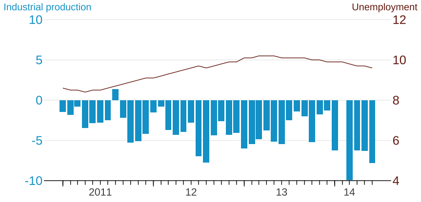
ggplot4$scatter_path(T)- Observe negative correlation between year-to-year change of industrial production and unemployment rate.
5.3.2.2 Graphic design
- A graph that shows negative correlated movements.
ggplot4$ggplot <- function(){
  ggplot(
    data= ggplot4$data |>
      subset(time <= "2014-06-01"),
    mapping=aes(x=time)
  )
}
ggplot4$industrialProduction <- function(){
  geom_col(
    mapping=aes(
      y=ind_procution_change
    ),
    fill="#04a2d0"
  )
}
ggplot4$unemployment <- function(){
  geom_line(
    aes(
      y=unemploymentRate
    ),
    color="#77230f"
  )
}
ggplot4$scale_y_ind_production <- function(...){
  scale_y_continuous(
    name="Industrial production",
    limits = c(-10, 11),
    breaks = seq(-10, 10, by=5),
    labels = seq(-10, 10, by=5),
    ...
  )
}
ggplot4$scale_y_unemployment <- function(...){
  scale_y_continuous(
    name="Unemployment",
    limits = c(3, 13),
    breaks = seq(4,12, by=2),
    ...
  )
}

ggplot4$just$industrialProduction <- function(){
  ggplot4$ggplot()+
    ggplot4$industrialProduction()+
    ggplot4$scale_y_ind_production()
}
ggplot4$just$unemployment <- function(){
  ggplot4$ggplot()+
    ggplot4$unemployment()+
    ggplot4$scale_y_unemployment()
}

ggplot4$twoSeries <- function(...){
  ggplot4$ggplot()+
    ggplot4$industrialProduction()+
    ggplot4$unemployment()+
    ggplot4$scale_y_ind_production(...)
}
ggplot4$twoSeries()
5.3.2.3 Secondary axis
ggplot4$sec_y_unemployment <- function(){

  # mapping left breaks to unemployment range
  # ggplot4$scale_y_ind_production() -> left_y
  # left_y$breaks |> range()

  transfer_leftBreaks = function(breaks){
      scales::rescale(breaks,
        from=c(-10,10), to=c(4, 12))
    }

  # left_y$breaks |> transfer_leftBreaks()
  sec_axis(
    name="Unemployment",
    trans=transfer_leftBreaks,
    breaks=seq(4, 12, by=2)
  )
}

ggplot4$twoSeries(
  sec.axis=ggplot4$sec_y_unemployment()
    )
5.3.2.4 Rescale right series
Unemployment is drawn based on left y scale, not based on the secondary (right) y scale.
One plot can only have one y scale to define y coordinate (which will be the left y).
Unemployment rate of 10 will be placed at the height of 10 as left y would show, but
Right y 10 is actually in line with left -5; So
We need to map unemployment rate of 10 to -5, which is an inverse transfer function of
transfer_leftBreaks.
ggplot4$scaled_unemployment <- function(){

  transferInv_leftBreaks <- function(breaks){
      scales::rescale(breaks,
        to=c(-10,10), from=c(4, 12))
    }

  geom_line(
    aes(
      y=transferInv_leftBreaks(unemploymentRate)
    ),
    color="#77230f"
  )
}

ggplot4$twoSeries_recaled <- function(){
  ggplot4$ggplot() +
    ggplot4$industrialProduction() +
    ggplot4$scaled_unemployment() +
    ggplot4$scale_y_ind_production(
      sec.axis=ggplot4$sec_y_unemployment(),
      expand=expansion(0,add=c(0,1))
    )
}
ggplot4$twoSeries_recaled()
5.3.2.5 Time axis
ggplot4$scale_x <- function(){
  scale_x_custom <- econDV2::axis_x_custom(scale_x_date)
  scale_x_custom(
    breaks = lubridate::ymd(c(paste(2011:2013,"06","01"), "2014-03-01")),
    labels = c("2011", "12", "13", "14"),
    ticks_major = lubridate::ymd(
      paste(2011:2014, "1", "1")
    ),
    ticks_minor = seq(
      from=lubridate::ymd("2011-01-01"),
      to=lubridate::ymd("2014-06-01"),
      by="1 month"
    )
  )
}
5.3.2.6 gg$dash
size=8 #input$size_title
size_text=8 #input$size_text
vjust=1 #input$vjust
angle=0 #input$angel
margin_l=-50 #input$margin_l
margin_r=-50 #input$margin_r
ggplot4$twoSeries_recaled() +
  ggplot4$scale_x() +
  theme(
    axis.title.x = element_blank(),
    axis.line.y=element_blank(),
    axis.ticks.y=element_blank(),
    panel.grid.major.y=
      element_line(color="#ececec"),
    axis.text.y.left=
      element_text(color="#04a2d0",
        size=size_text
      ),
    axis.text.y.right=
      element_text(color="#77230f",
        size=size_text
      ),
    axis.title.y.left =
      element_text(
        color="#04a2d0",
        size=size,
        vjust=vjust,
        angle=angle,
        margin=margin(
          r=margin_l
          )
        ),
    axis.title.y.right =
      element_text(
        color="#77230f",
        size=size,
        vjust=vjust,
        angle=angle,
        margin=margin(
          l=margin_r
          )
        ),
    axis.ticks.length.y=unit(0,"mm")
  )
5.3.2.7 final plot
ggplot4$finalPlot <- function(){
  size <- 15
  size_text <- 19
  vjust <- 1
  angle <- 0
  margin_l <- -103
  margin_r <- -84
  ggplot4$twoSeries_recaled() +
    ggplot4$scale_x() +
    theme(
      axis.title.x = element_blank(),
      axis.line.y = element_blank(),
      axis.ticks.y = element_blank(),
      panel.grid.major.y =
        element_line(color = "#ececec"),
      axis.text.y.left =
        element_text(
          color = "#04a2d0",
          size = size_text
        ),
      axis.text.y.right =
        element_text(
          color = "#77230f",
          size = size_text
        ),
      axis.title.y.left =
        element_text(
          color = "#04a2d0",
          size = size,
          vjust = vjust,
          angle = angle,
          margin = margin(
            r = margin_l
          )
        ),
      axis.title.y.right =
        element_text(
          color = "#77230f",
          size = size,
          vjust = vjust,
          angle = angle,
          margin = margin(
            l = margin_r
          )
        ),
      axis.ticks.length.y = unit(0, "mm")
    )
}
ggplot4$finalPlot()
5.4 Color/Fill
5.4.1 Discrete

Set up simulated data:
dataSet3 <- data.frame(
  x=seq(
    from=lubridate::ymd("2020-01-03"),
    to=lubridate::ymd("2020-08-12"),
    by="1 day"
  )
)
countries <- c("Britain","France","Germany","Italy","Spain")
slopes <- c(0.1, 0.2, 0.3, 0.4, 0.5)
for(i in seq_along(slopes)){
  dataSet3[[countries[[i]]]] <-
    0 + slopes[[i]]*as.integer(dataSet3$x-dataSet3$x[[1]])
}
dataSet3 |>
  tidyr::pivot_longer(
    cols="Britain":"Spain",
    names_to = "country",
    values_to = "y"
  ) -> dataSet3
Initiate a base plot:
ggplot3 <- list()
ggplot3$data <- dataSet3
ggplot3$plot1 <- function(){
  ggplot()+
    geom_line(
      data=ggplot3$data,
      mapping=aes(
        x=x,
        y=y,
        group=country,
        color=country
      )
    )
}

ggplot3$plot1()
Formulate the plotting process as a function has an advantage of data set substitutability. We can substitute ggplot3$data by:
ggplot3$data <- new_data
ggplot3$plot1()
This is because function is lazily evaluated which will look for
ggplot3$datawhen it is called.The birth place of
ggplot3$plot1function is global environment. Therefore, any update ofggplot3$datain global environment before a call ofggplot3$plot1will always be based on the updated value.
Prepare color scale:
ggplot3$color$limits <- c("Britain", "France", "Germany", "Italy", "Spain")
ggplot3$color$values <- c("#984152", "#1e80ab", "#2ec1d2", "#af959f", "#e5b865")
ggplot3$color$labels <- c("英", "法", "德", "義", "西")
Formulate the scale_color_manual call as a function
ggplot3$scale_color_manual <- function()
{
  limits = ggplot3$color$limits
  values = ggplot3$color$values

  # a call to scale_color_manual
  scale_color_manual(
    limits = limits,
    values = values,
    breaks = limits,
    labels = ggplot3$color$labels
  )
}ggplot3$plot1() +
ggplot3$scale_color_manual(){...} returns the visible value of the last executed line.
ggplot3$axis_x_date_monthlyPeriod <- function()
{
  dd <- data.frame(
    x = ggplot3$data$x
  )
  require(dplyr)
  dd %>%
    arrange(x) %>%
    mutate(
      year=lubridate::year(x),
      month=lubridate::month(x)
    ) %>%
    group_by(year,month) %>%
    distinct() %>%
    summarise(
      day1 = min(x),
      midlength = round(length(x)/2,0),
      breaks = day1 + lubridate::days(midlength),
      labels = lubridate::month(breaks, label=T)
    ) %>% ungroup() -> dx
  xrange <- range(dd$x)
  rug_x <- {
    c(xrange, dx$day1) |>
      unique() |>
      sort()
  }

  list(
    geom_rug(
      mapping=aes(
        x=rug_x
      ),
      outside = T
    ),
    coord_cartesian(clip="off"),
    scale_x_date(
      breaks=dx$breaks,
      labels = dx$labels
    ),
    theme(
      axis.ticks.length.x = grid::unit(0,"mm")
    )
  )
}ggplot3$plot1() +
ggplot3$scale_color_manual() +
ggplot3$axis_x_date_monthlyPeriod()5.4.2 Continuous

5.5 Exercise

